Ahh it’s good to be back! We took a little break from blogs this past month and it was actually quite refreshing. We felt the content was redundant and wasn’t as purposeful as it should be. With that being said, we will be doing monthly blogs instead of weekly to make sure we are sharing the best content possible. First up, from our blog hiatus is the the Ashford - a basement remodel!
What a fun and slightly challenging project! As we have said before, we pride ourselves on our ability to work with any and every style. We love design and love the challenge that comes with working with styles that differ from our own. In our sneak peak posted in May, we said that this basement remodel was born out of necessity as the homeowners experienced water in their basement. Ughh, frustrating for them - fun for us!
The style of the basement is rather transitional because the home itself is very traditional. The family basically wanted their basement to be updated, but still needed it to blend with what was going on upstairs (where they will eventually remodel that as well). So our challenge? How do we update the basement, but keep it traditional enough that it doesn’t look like two completely different homes? See below for the result!
The basement was originally mustard and maroon and took on a rather dark appearance. We really wanted to lighten and brighten the space to make it more inviting for entertaining.
Some of the challenge when working with a large basement (or basement in general) is defining spaces. This can be done with area rugs and even lighting!
The lounge area is one of our favorites and features this awesome custom wine wall.
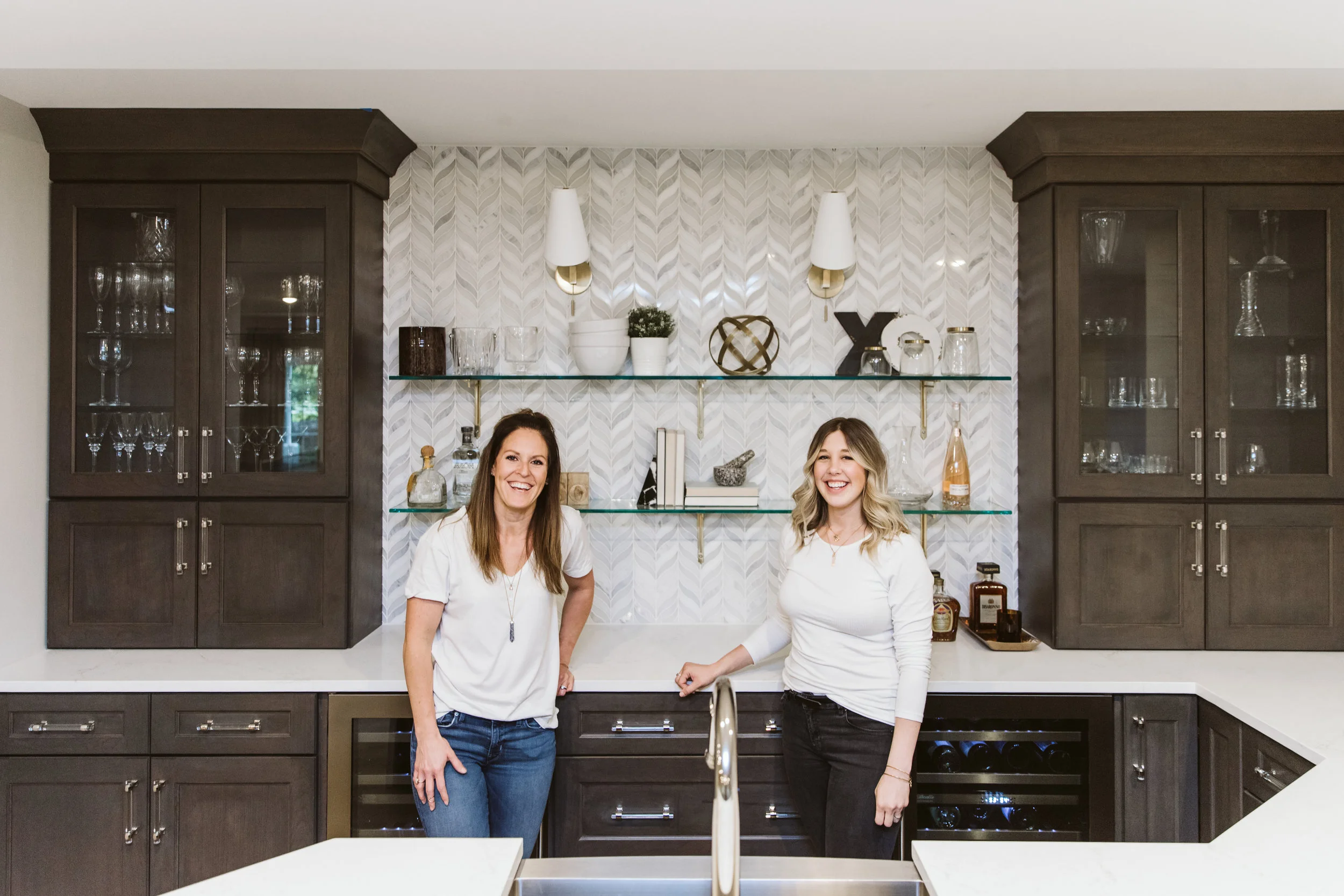
The bar was one our favorites to work on and is an area where we did push the style a little more than in any other. By keeping the cabinetry more traditional we were able to add some modern flair in the sconces, backsplash and chairs.
To help keep the cabinets more traditional, we not only focused on door style and color, we also focused on hardware selection. We chose these beautiful mixed finish (lucite with polished nickel) pulls to aid in the look.
The bath was located right next to the workout room and made for the perfect at home gym.
And there you have it! We had a ton of fun on this project and are excited to see the finished product. Let us know what you think in the comments below!


